NHS Staff Sickness Data: In Searching for Vaccine Effectiveness, We Must Also Consider Harm
What NHS staff sickness trends suggest about the official narrative
- Something changed structurally in NHS workforce health metrics around May 2021.
- That change is statistically verifiable through standard break‑detection methods.
- COVID infection stops being the main predictor of absence after widespread vaccination.
- There is no visible benefit to the vaccine at all.
- Statistical evidence alone cannot tell whether that’s direct vaccine toxicity, changes in reporting, behavioral burnout, or systems collapse - but it justifies a full, transparent inquiry with anonymized individual-level data.
Ian Copeland, one of those tireless defenders of pharmaceutical orthodoxy whose confidence always seems inversely proportional to his comprehension, recently shared an intriguing chart from “Tern”.
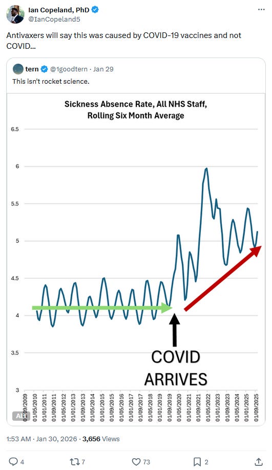
At first I verified that - for once - Tern hadn’t botched the picture with non-normalized figures or some other artifact. A quick check confirmed the rates were directly calculated by the NHS.1
That said, Tern’s “analysis” still isn’t analysis. It’s the kind of eyeballing any high-school student with Excel could improve - starting with a basic seasonal baseline and a quick look for structural breaks.
And since both keep invoking “antivaxxers” in the subsequent conversation2 - by which they seem to mean anyone who doesn’t dutifully line up for regular flu and COVID boosters, myself included - let’s do this properly.
I reproduced - and “slightly extended” - Tern’s plot (R):
It then estimates an “observable norm” using 2010-2018 only by fitting an ordinary least squares baseline to the raw monthly rates, with a linear time term and explicit seasonality via month-of-year fixed effects. That baseline model is projected forward over the full period to generate expected values plus confidence and prediction intervals; for visual comparability, the expected series (and its prediction band) is also rolled using the same six-month window.
From there, the script computes deviations from the norm - both in absolute terms (per 100,000 staff) and in relative terms (percent above/below the rolled baseline). Structural change is then assessed using the Bai-Perron multiple-breakpoints framework applied not to the raw sickness rates, but to the baseline-adjusted deviation series (the raw deviation-from-norm).3 In other words, the breakpoints target shifts in abnormality relative to the 2010-2018 regime, rather than breaks driven by seasonality or the long-run secular trend already captured by the baseline.
The first confirmed COVID-19 cases in the UK were officially reported at the end of January 2020. But rather than litigate narratives, I’ll stick to one lens: what the data show.
Alongside that date, I’ve annotated the chart with hard-coded markers: the point when NHS staff vaccination reached 90% (near the ~92% peak)4; the announcement of a care-home worker mandate in November 2021;5 and the subsequent abandonment of those mandate plans in March and April 2022.6
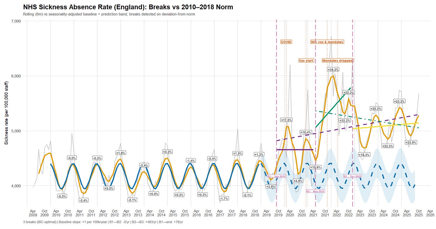
Briefly:
a. The sickness-absence rate starts rising before the first officially reported UK COVID-19 cases and crosses a first break (“B1”) in September 2019 - already above what the pre-2019 baseline would normally allow, even at the winter peak. By the time cases are reported, the series has effectively overshot the expected seasonal maximum; it then surges again in April 2020, far beyond the observed winter norm.
b. A second break (“B2”) appears in May 2021, when the deviation from baseline shifts into a persistently higher regime - “worse than ever,” and suggestive of an additional factor entering the system.
c. A third break (“B3”) shows up in late December 2022, marking a transition into a downward trend - though the series still does not return to the pre-2019 baseline.
At first glance, two broad candidates plausibly contribute to these regime shifts and are worth examining:
- What is commonly framed as a “new pathogen” (COVID-19), including the rapid succession of variants (Delta, Omicron, and so on).
- The introduction of new pharmaceutical interventions deployed at scale.
Beyond that, it’s also worth tracking how the recorded reasons for absence evolve over time, and whether staff mortality indicators move in tandem with (or decouple from) the sickness-absence signal.
A new pathogen
In theory, if SARS-CoV-2 is the main reason NHS sickness absence departs from the pre-2019 norm, we should see sickness spikes move with the UK COVID-19 test-positivity rate - at least from February 2020 onward, when UK positivity data become available.7
A first script (R) downloads PCR-only positivity data and daily PCR testing volumes from UK Health Security Agency. It then aggregates the daily seven-day positivity percentage into a monthly mean, and computes the monthly mean of the daily seven-day average number of tests performed.8 9
A second script (R) plots the six-month rolling average of PCR positivity and monthly testing volumes, alongside the six-month rolling sickness-absence rate and the baseline projection established above.
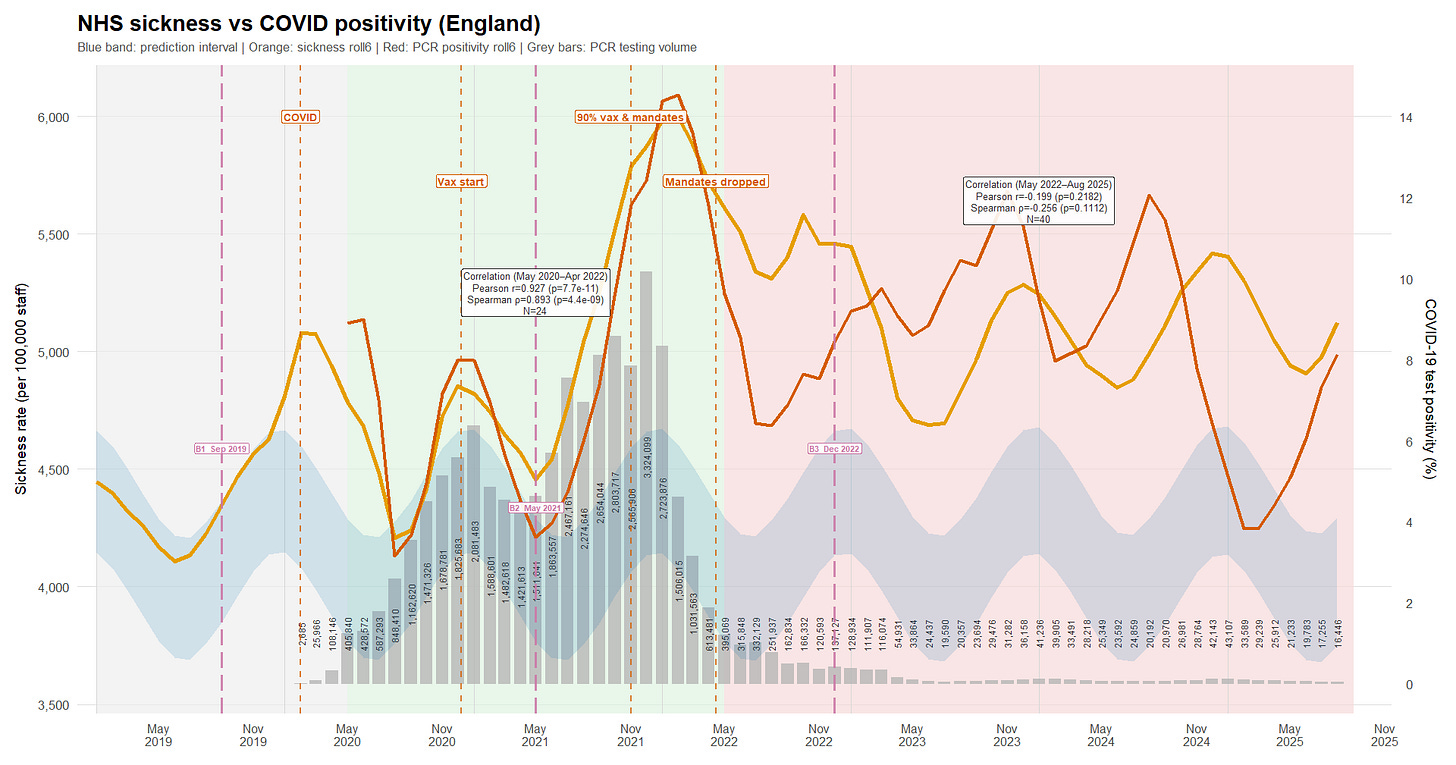
From May 2020 to April 2022 (green background), there is a very strong positive association between the six-month rolling PCR-positivity series and the six-month rolling sickness series (Pearson r = 0.927; Spearman ρ = 0.893), with extremely small p-values and a tight Pearson confidence interval (0.836 - 0.968). In plain terms: over that period, the two lines mostly rise and fall together. At that smoothing level, COVID dynamics plausibly explain most of the abnormal sickness signal.
From May 2022 onward (red background), the relationship collapses and even tilts slightly negative (Pearson r = -0.199; Spearman ρ = -0.256), but without strong statistical support (p = 0.218 and p = 0.111; Pearson CI -0.481 to 0.120 includes zero). That pattern suggests whatever drove the tight co-movement earlier-pandemic waves and the associated absence dynamics-no longer dominated the sickness series in the later period, at least not in a simple monotonic way at this level of smoothing.
Testing volume did fall sharply. If NHS staff testing remained more intensive than population-level testing - and if the remaining PCR stream remained broadly representative of infection dynamics - then there is still enough signal to track major COVID waves.10 But the weakening correlation cannot be waved away as “less testing” without engaging with that representativeness question.
Nor are viral variants a satisfying explanation for the timing of the decoupling: Delta variant emerged in the United Kingdom in mid-March 2021 and became dominant by June,11 12 and Omicron variant emerged in late November 2021 and became dominant in December13 14 - well before the break in the sickness/positivity relationship is observed.
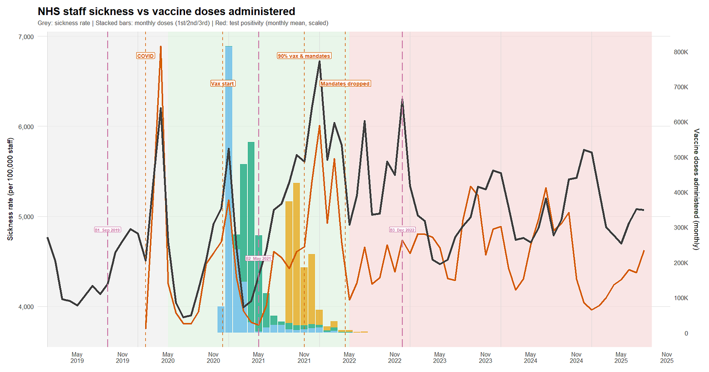
A set of new experimental products
At this point, since the “all-time high” in sickness absence appears to coincide with the vaccine rollout, it’s worth checking how tightly the two series move together.
Unfortunately, NHS staff vaccination coverage cannot be fully reconstructed month by month from the “Trust HCW” tab in the NHS “Monthly COVID-19 vaccination publications - January 2021 to September 2022”.15 16 By the time the breakdown becomes available (September 2021 at the earliest, based on an August 31 cut-off), 91.8% of staff already had at least one dose - so the steepest part of the roll-out is already behind us.
So I instead use official announcements as anchor points:
- The large-scale vaccination campaign for staff began around late December 2020.17
- 60% had received at least one dose in January 2021.18
- 76% had received at least one dose in February.19 20
- 80.5% had received at least one dose in early March.
- 87.8% had received at least one dose as of May 16.21
- 91.8% had received at least one dose and 87.8% had received two doses by the end of August,22 at which point the monthly reports can be used directly.
- By mid-September, the booster campaign was launched.23
The reconstruction model (R) converts these “snapshot” percentages into a day-by-day rollout for a 1.48 million - staff cohort,24 then aggregates the resulting daily counts back to monthly totals. First doses are interpolated between anchor points and distributed with a simple weekday/weekend pattern so delivery is not implausibly flat. Second doses are derived mechanically from first doses (rather than being guessed separately) using a hard 21-day minimum and a return-delay distribution (mean 60 days, sd 20), then rescaled to match the official end-of-month dose-2 anchors. Boosters are generated similarly from second doses, with a 90-day minimum; they are constrained to start after mid-September 2021 and scaled to the booster anchors. As a sanity check, the reconstructed series matches the first- and second-dose anchors almost exactly, with only minor (0.1 - 0.3 percentage-point) discrepancies where reported coverage itself briefly dips.
This makes it possible to plot, on the same timeline, monthly sickness absence, PCR test positivity, and the reconstructed administered-dose series (R).
I reran the dose reconstruction with median extra-delay values of 45/60/75 days (sd 20), keeping the hard minimum gaps (21 days for dose 2; 90 days for boosters) and re-fitting to the same official coverage anchors. Dose-2 anchor fit remains tight across scenarios (<0.3 pct-pt max error). Booster anchors show a small residual (~0.8-1.2 pct-pt) under monotone constraints. Importantly, the substantive inference is robust: the correlation between monthly administered doses (dose2+dose3) and sickness is stable across scenarios (overall r ~ -0.32 to -0.38; within May 2020-Apr 2022 r ~ -0.36 to -0.42). Peak timing shifts by at most ~one month.
Death Rates Across the Period
If you ask Tern what “deaths” look like among NHS staff, he’ll tell you people are *dying* more and more lately - based on plots he admits he can produce in a minute (without irony25).
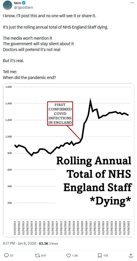
Thankfully, we know better than to take anonymous (or not), code-free analysis at face value - especially when it leans on non-normalized figures to sell a narrative.
Here, staff deaths come from the “Reasons for Leaving” dataset,26 and workforce statistics provide the denominator.27 Because deaths are reported by financial year (1 April to 31 March) and split into quarters, I compute quarterly death rates using the workforce headcount at the start of the financial year (April) as the denominator for that year’s quarters. I then plot those rates alongside the quarter-average PCR positivity, the quarter-average sickness-absence rate, and the total administered-dose counts over the same quarter (R).
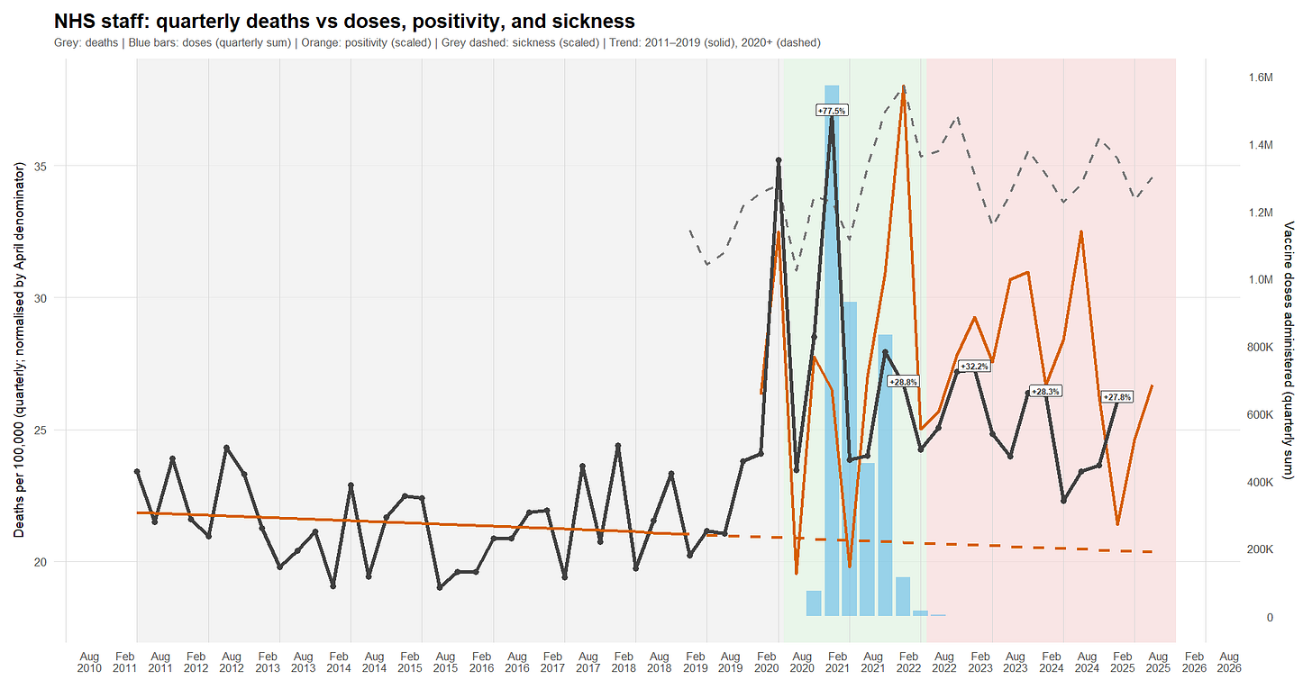
- Death spikes coincide with both COVID waves and vaccination campaigns.
- As with sickness absence, the staff death-rate signal stops being meaningfully correlated with COVID soon after the vaccination campaign is completed.
- However - unlike sickness, and unlike the impression conveyed by Tern - the annualized death rate shows something close to a return toward baseline. It remains elevated relative to the 2011 - 2019 linear trend, but it is broadly back in the vicinity of early-2010s levels (around 2012).
Absences by Organisation Type
The NHS publishes monthly staff sickness-absence rates split by organisation type (acute hospitals, ambulance, mental health trusts, etc.).28 We combined the historical files (they come in a few different formats over time - R) and plotted the trend (R).
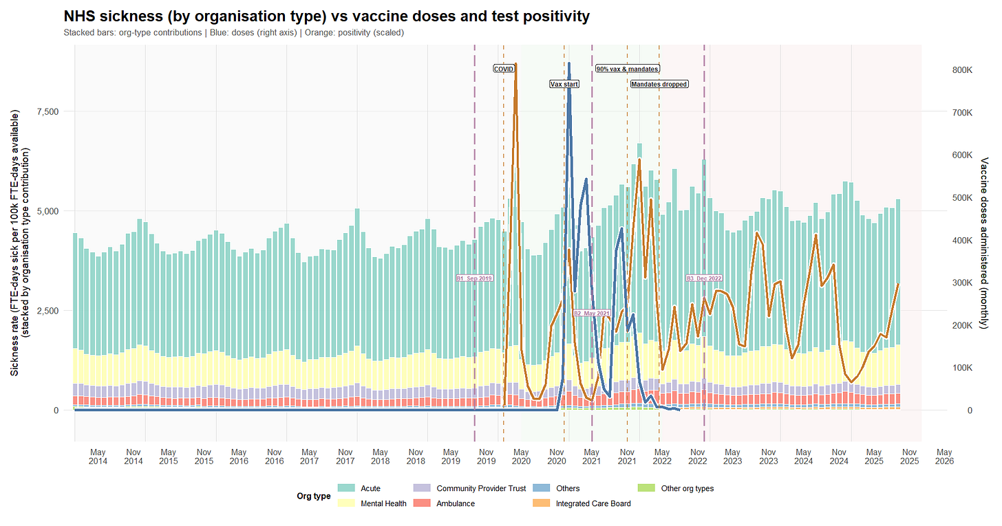
What we see over time:
1) Before COVID (late 2019 to spring 2021): mostly stable, with one huge shock
- Sickness absence is fairly steady overall.
- The big exception is April 2020, which shows a major spike (the first COVID wave).
- In that period, higher COVID test positivity tends to coincide with higher sickness absence (which is what you’d expect).
2) Mid-pandemic (mid-2021 to end-2022): a higher “new normal”
- From around May 2021, the whole sickness-absence level shifts upward by roughly 15-20% compared with pre-COVID.
- There’s another clear high point around January 2022, lining up with a major infection wave.
- Organisation type shares don’t meaningfully change (acute and mental health remain the bulk). Some visible “changes” look like NHS admin reorganization (older bodies disappearing, new ones appearing), not real behavioral shifts.
3) After end-2022 (through end-2024): steadier, but still elevated
- Sickness absence starts high in late 2022, then settles.
- The big swings become less frequent.
- The level remains above pre-COVID, even if it’s a bit lower than the mid-pandemic peak period - roughly +15% higher.
What about vaccination?
- Vaccine roll-out happens late in the first window and ramps up in early 2021.
- In these monthly data, vaccine-dose volume does not move in step with short-term sickness absence (which could mean any effect is delayed, indirect, small relative to waves, or not detectable at this resolution).
- Finally, we do not have administered-dose data for every month after B3, so any post-B3 “vaccine versus sickness” interpretation simply cannot be supported from these data.
Evolution of the shares of the reasons for absence
We also looked at a separate NHS dataset that breaks absences down by reason. It only goes back to April 2019, so the “pre-COVID baseline” is shorter than ideal.
Again, a first script (R) cleans, harmonizes, and normalizes the data across the historical file formats, and a second produces the plot below (R).
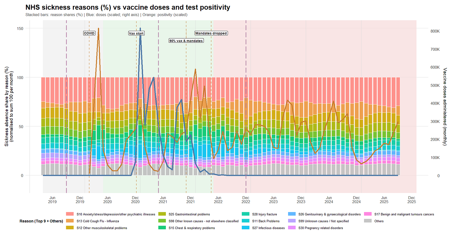
The broad picture is:
- Mental health-related absence is consistently one of the biggest categories - about a quarter of all absence - and stays high across the whole period. Musculoskeletal issues (back pain, other MSK problems) are also consistently large and fairly stable.
- During the stronger COVID/winter wave period (mid-2021 to end-2022), respiratory/infectious categories take up more share of total absence - which fits the idea of extra communicable disease burden on top of an otherwise stable baseline.
- After end-2022, recorded test positivity becomes less tightly connected to sickness absence.
“Cold/flu” vs Vaccines
If vaccination reduced everyday respiratory illness-related absence, you might expect the “cold/cough/flu” share to drop after roll-out. In this dataset, that drop doesn’t appear.
If anything, the Cold/Cough/Flu (S13) share is slightly higher in later periods than earlier ones - in a context of overall increase of the sickness rates. S13’s share increases across period averages: ~7.9% in the pre-rollout window (B1→B2), ~9.9% during the main roll-out/mandates era (B2→B3), and ~10.6% thereafter.
Some modeling fun
At this point, I made an effort to understand Ian & Tern’s worldview by testing a few scenarios using a small SIRS model (R).
In this first set of scenarios, COVID arrives when it is officially declared, and I test various vaccine-effectiveness assumptions across three scenarios:
1. COVID adds a static burden that doesn’t vary over time.
2. COVID causes exponential damage (the “Tern scenario”).
3. COVID behaves like a “normal” virus and its severity decreases over time.
While the third scenario outperforms the others (r = 0.44), we are still far from a realistic picture. Most annoyingly, because the SIRS model produces a realistic infection-spread curve, we completely miss the first wave and - except in the third approach - systematically overestimate the second wave.
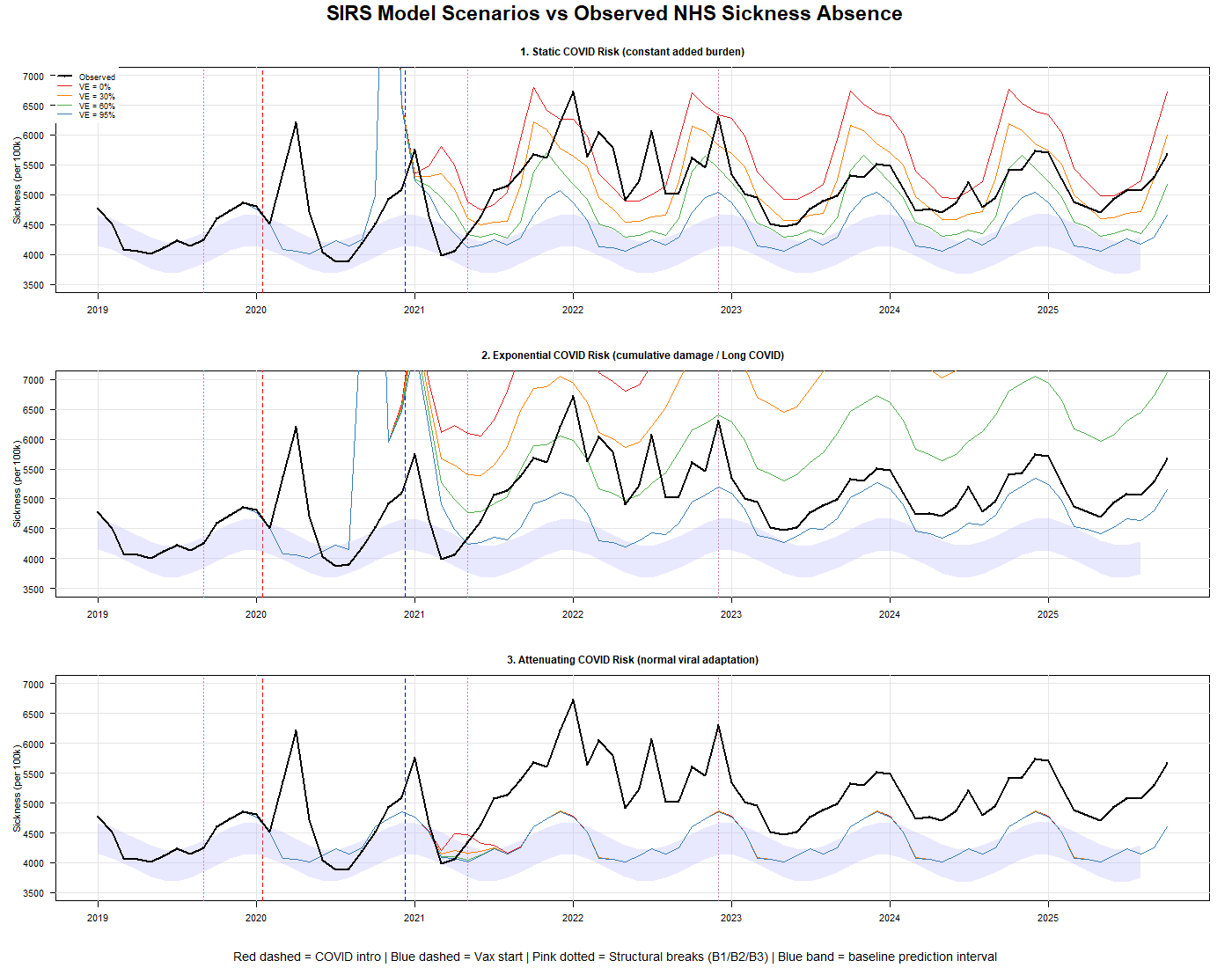
That’s unsatisfying - because either we’re using the wrong model (and an SIRS framework should be well suited to a cohort of health-care workers exposed to high reinfection risk), or COVID didn’t arrive when we were told.
The next logical step, then, was to shift the “COVID arrival date” parameter to our B1 inflection point in September 2019. Lo and behold, Scenario 3 performs much better.
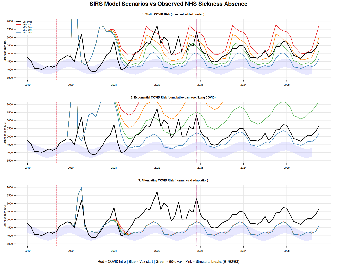
However, we’re not there yet. I therefore added a fourth scenario (R), in which vaccination increases recipients’ overall sickness risk. The result is self-explanatory: Scenario 4 dramatically outperforms all others. The Root Mean Square Error (RMSE29) improves from 784 (best attenuating scenario) to 506.8 (a 35% reduction), and the correlation jumps from 0.46 to 0.643. In plain terms, the RMSE drop means the model’s typical prediction error is much smaller—its predictions land noticeably closer to the observed values on average.
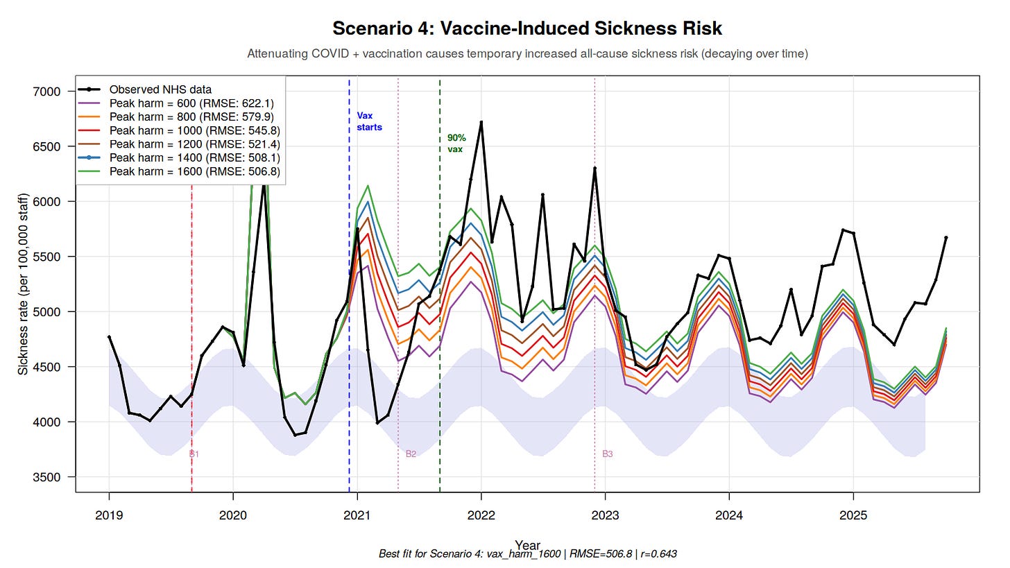
The best-fitting model suggests that each vaccinated cohort contributes approximately 1,600 additional sickness absence days per 100,000 staff at peak, which then decays over time. With 814,000 staff vaccinated in January 2021 alone (55% of the workforce), that single cohort would contribute substantially to the B2 regime shift.
Of course, Tern and others will claim it’s COVID, not the vaccine. But if that were true, the phenomenon we observe - toxicity waning after the initial exposure - should be increasing exponentially. We observe the opposite.
The remaining misfit (correlation 0.64 vs an ideal 1.0) likely reflects the model still missing the sharp wave peaks: it captures the overall level well, but not the spikes.
Conclusion
Consistent with the patterns we observed in New Zealand,30 Israel,31 and the Pfizer trial,32 I find no evidence here that the vaccine roll-out improved the course of the COVID-19 pandemic. If anything - while this dataset cannot establish causation - the signals are compatible with the opposite: the post-rollout period looks worse on the outcomes examined than the pre-roll-out baseline would have led us to expect.
By an irony of fate, a 95%+ vaccinated, 80%+ boosted workforce appears to be sicker - and to experience higher-than-normal death rates - after adopting the intervention that was sold as protection from a new hazard. More strikingly, the hazard itself does not vanish after a supposedly “95% effective” roll-out; instead, in the later period the excess sickness signal largely decouples from measured COVID positivity.
That is unfortunate, because it is not the theoretical behavior - nor what was marketed to the public.
It is also not especially surprising, if one has understood that these highly variable products33 should never have been authorized in the first place, and that informed consent was violated in multiple ways.34
And the broader pattern extends beyond COVID. The same platform applied to influenza - this time tested in a slightly less fraudulent clinical-trial setting, and with several more years of R&D - has recently produced a conspicuous failure.35 Strange how that works.
In the October 2024 campaign, 21% of NHS staff received a COVID vaccination, versus 40.6% receiving a flu vaccine.36 If “full protection” lasts only three months, then the simplest interpretation is that most staff have already drawn their own conclusions from lived experience - and became “antivaxxers”, like us.
Thanks to people like Ian Copeland, his colleagues, and to what may be the most consequential product failure in modern public-health history.

But don’t worry: according to a plethora of studies, the COVID vaccine also protects you from car accidents and other hazards (studies that, in my view, are not worth the paper they’re printed on).37 And remember: trust in “Science” is collapsing “because antivaxxers”.
In a next article, I’ll go after the root enchantment that sustains this delusion: the disastrous state of real-world data. I’ll show why many PhDs - who have never had to grapple with messy databases in production - consistently fail to understand real-world data flaws the moment those flaws become politically inconvenient, by examining what the official numbers say about the Pfizer vaccine’s performance in the Czech Republic.
💬 Join the conversation
Want to like, comment, or share this article?
Head over to our Substack page to engage with the community.
Likes, comments, and shares are synchronized here every 5 minutes.
💬 Join the conversation
Want to like, comment, or share this article?
Head over to our Substack page to engage with the community.
Likes, comments, and shares are synchronized here every 5 minutes.