Swedish Data - A quick dive into births, deaths, and COVID-19 data
And a major red-flag on Swedish fertility.
Introduction
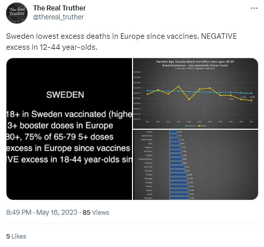
We made a quick detour out of our C4591001 monomania to quickly review the Swedish data, parroted a lot lately by pharma’s virtual-shills as an “undeniable proof of success” for the COVID-19 vaccines.
According to - for example, The Real Pusher hereafter, excess deaths would have been down thanks to “the vaccines”.
The English or French press tells us everything is pretty much fine in Sweden, and demographers are singing the merits of their great public policies, allowing to maintain an impressive fertility rate, compared to the rest of the “developed countries”1.
Sweden’s emigration2 and immigration3 current statistics are painting the picture of a country with a positive migration input to its general population (100K immigrating against 50K emigrating in 2022).
We briefly considered some perspective on the historical input of emigration & immigration in our population figures.
We review here general demographic considerations, and compare the 2020, 2021 & 2022 deaths & births rates to a [2010 - 2019] baseline.
This will allow us to verify that one of the “arguments” we heard while trying to debate a propagandist4 on the Pfizer fraud; “Swedish data proved the ‘vaccine’ works” is nothing but fallacy.
Deaths are indeed below baseline in most age groups in Sweden since the vaccine roll-out. But so were they during 2020, prior the “vaccines” - and there is no visible impact of their alleged effectiveness in the deaths data.
On another hand, there is a major red flag as far as the births in Sweden are concerned, with a major drop of the fertility in 2022.
Igor Chudov, on his Substack, had already noted similar phenomenons in UK5 or Germany6, and concerning alert signals in the U.S7.
Maryanne Demasi, PhD, has alerted multiple times on the unknown risks in pregnancies, along the fact that Pfizer hadn’t judge useful to conclude its clinical trial in pregnant women8.
Last but not least, Twitter’s most famous Mouse9, Arkmedic10 and our friend Geoff Pain11 have blown the whistle repeatedly on the known & unknown dangers of the shots for the population we should protect most, the pregnant women.
Further studies of this major alert signal must, therefore, be conducted at individual country scales.
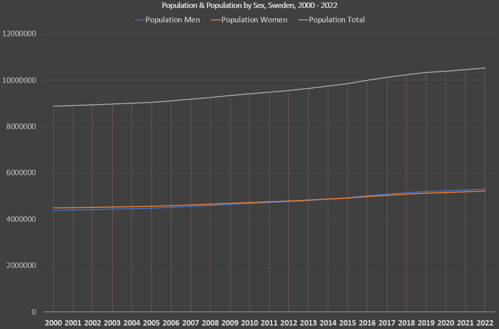
Population Trends from 2000 to 2022
The overall population (total & by sex), births & deaths, are represented in the following table & chart from 2000 to 2022, and can be downloaded on this Google Spreadsheet12. It paints the picture of a nice and steady growth of the Swedish population.
Population & Population by sex
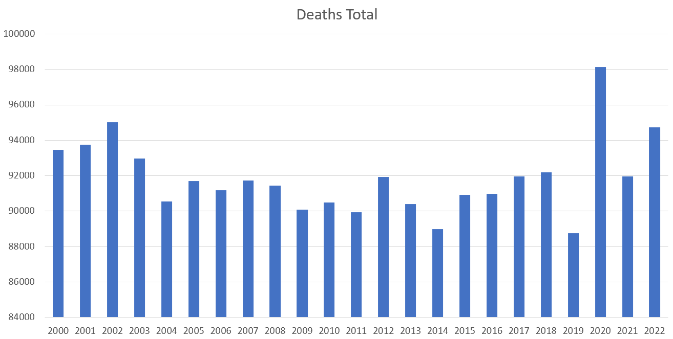
Deaths
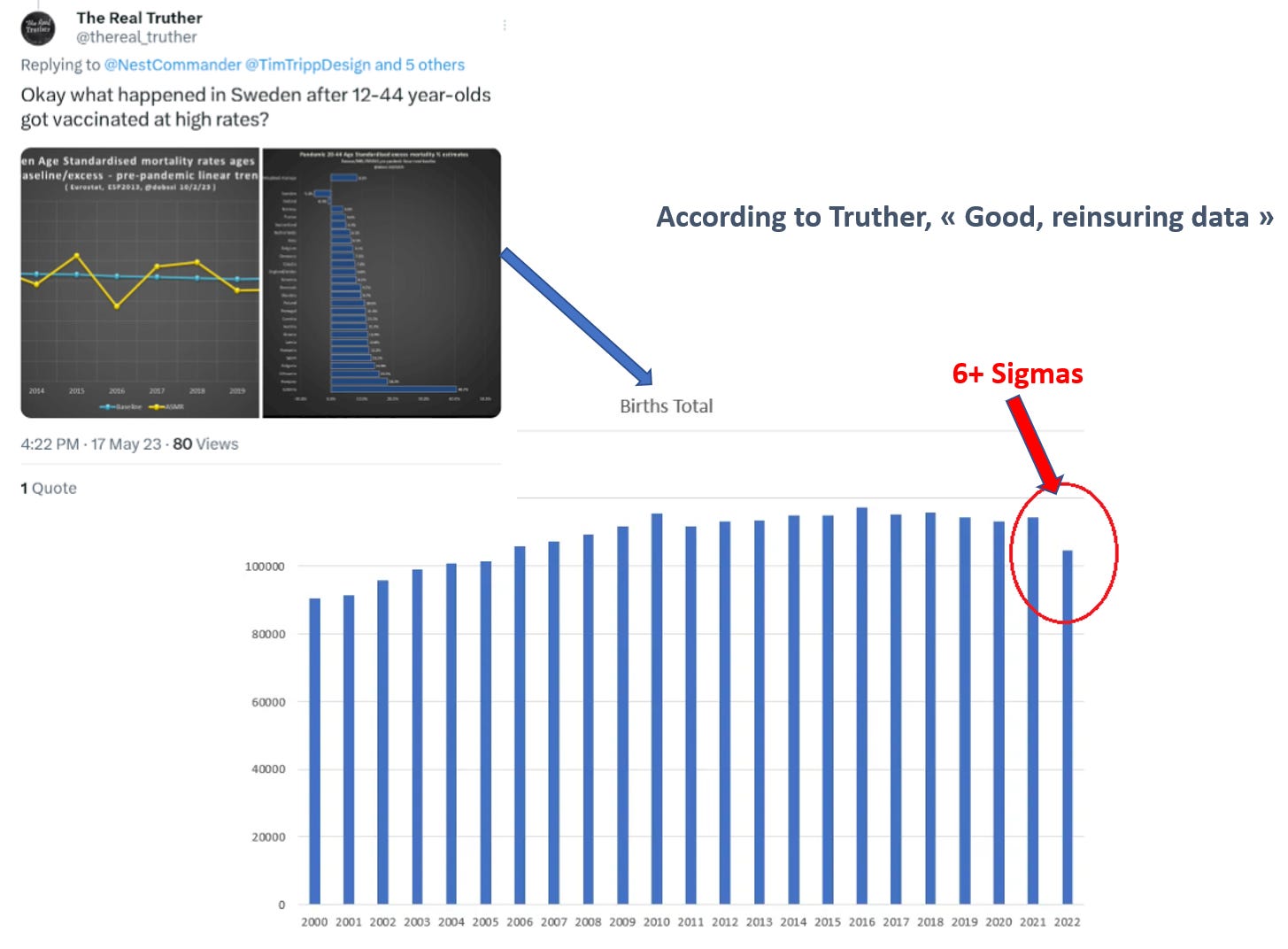
Births
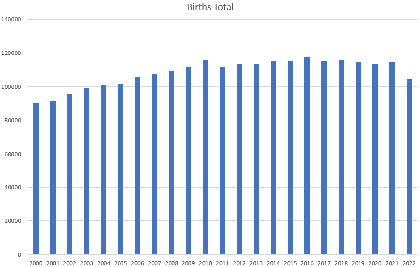
Obviously there is a “small issue” in 2022. We will come back to it below.
Yearly, “natural growth” & evaluating immigration
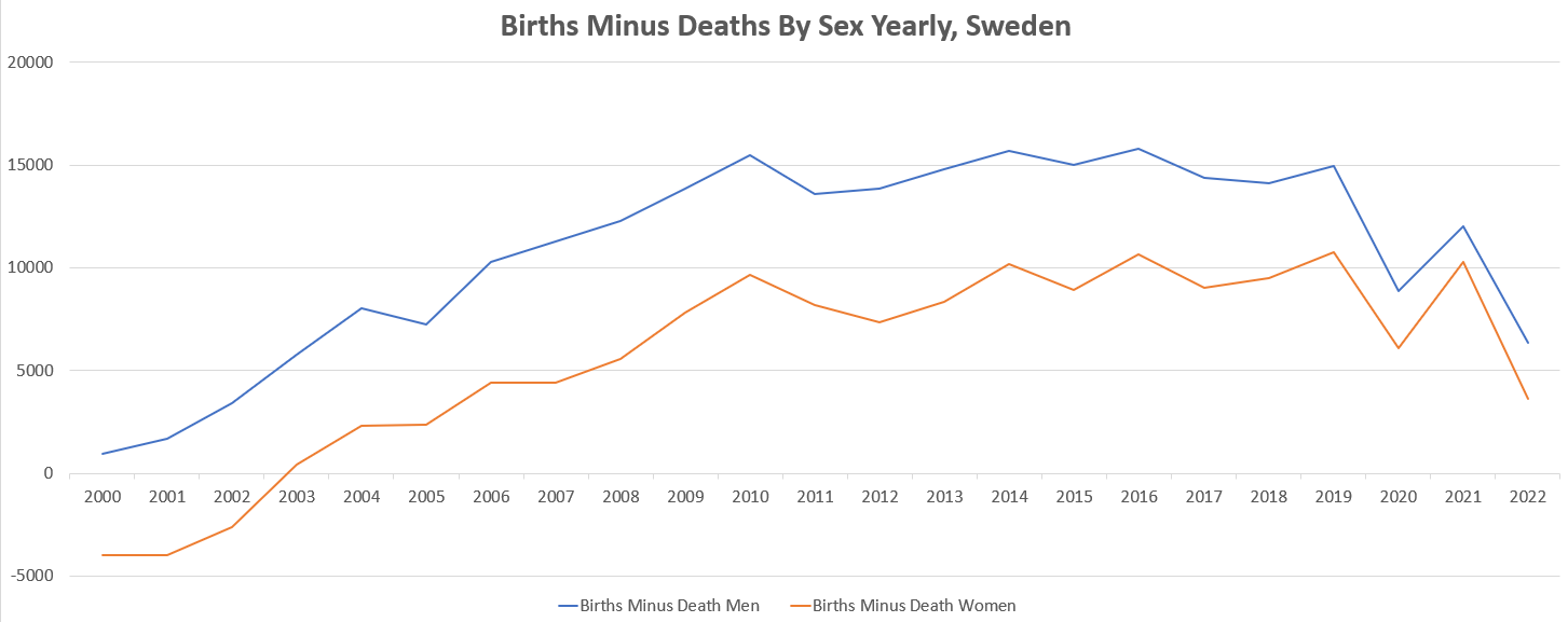
Charting the total of births minus deaths each year (natural growth), by sex, we can observe with horror that the Swedish women were on a negative trend in 2000, which luckily reversed in 2003.
We can also chart the total of births & deaths each year, along with the population offsets with the former year, which gives us a good idea of the positive addendum of the immigration to the Swedish population (“population offset to last year - (people born this year - people dead this year) =~ official immigration”).
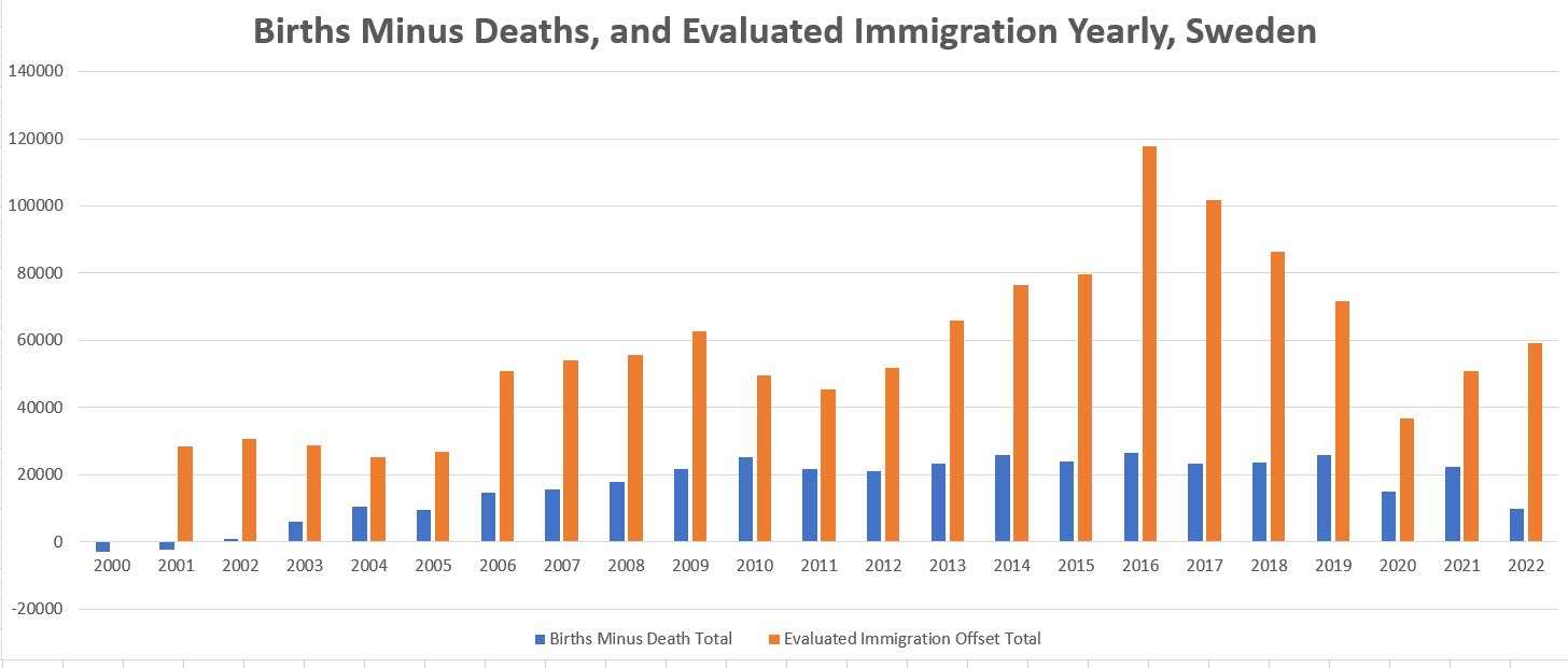
From that, we can conclude that - while better placed than most “developed” Western European countries - Sweden’s still modest population growth is compensated by an immigration which, after a spike in 2016, is lowering to its 2006 - 2009 trends.
2016 was a year of Syrian “Civil War” and Zika Virus, hence it makes sense to have seen an increase in immigration13.
Births & Deaths to Baselines
Deaths by age groups, and Births, are represented in the following breakdowns.
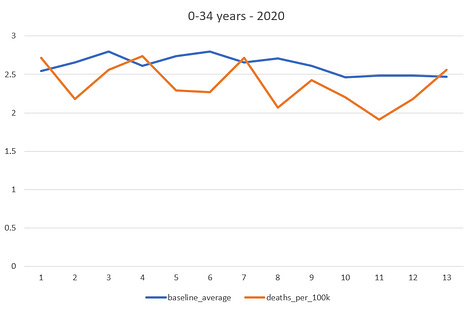
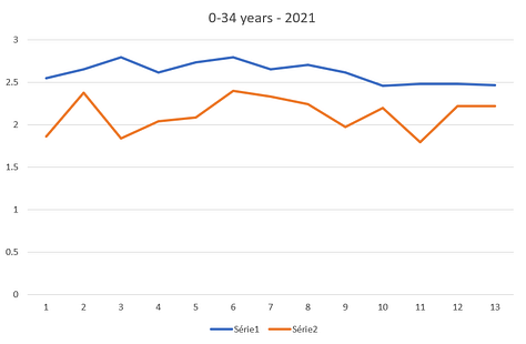
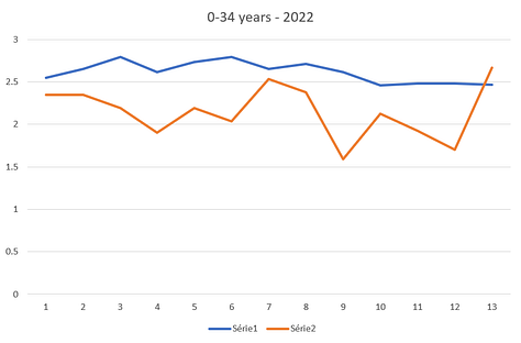
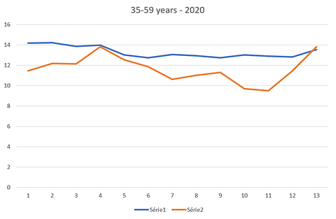
Deaths to baseline, by age group
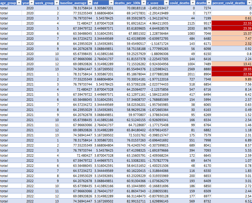
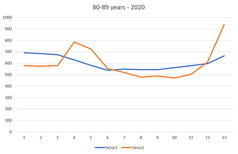
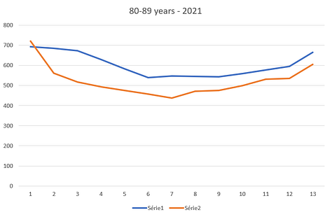
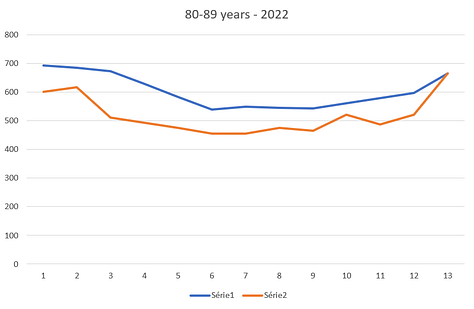
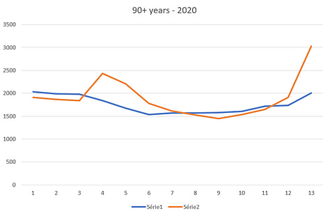
We grouped the 52-53 weeks of deaths data, available on each year, in 13 groups of 4 weeks (a fifth was included in “week group 13” when 53 weeks in a year), and measured the z-score on each variation in deaths of 2020, 2021 & 2022 against the 2010-2019 baselines.
The values14 were quite puzzling, as the COVID pandemic itself was “less visible” than in other countries. We therefore produced another view on the total deaths, along with the percentage of deaths “attributed to COVID” according to the official figures.
Weeks groups with abnormal high death figures are highlighted in dark red.
Contrarily to births, there are few significant variations.
2020 - All causes & Percent of COVID deaths
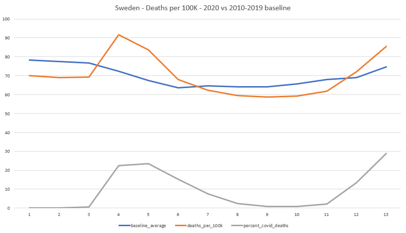
The peak of the pandemic is reached in the 16th to the 20th week of 2020.
No improvement of the percentage of deaths related to COVID is discernible post roll-out of the “vaccines” and the improvement of the COVID impact is far more likely related to the fact that the treatment protocols improved.
0-34 years old (all causes) deaths
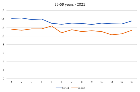
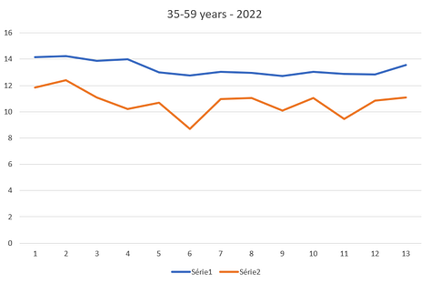
35-59 years deaths
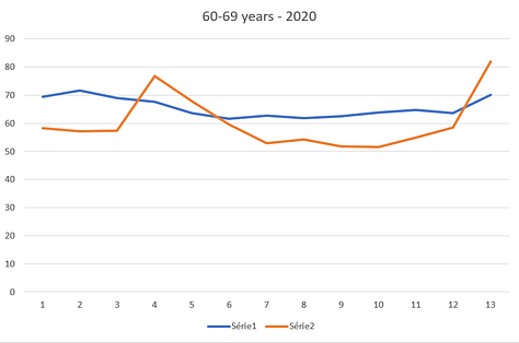
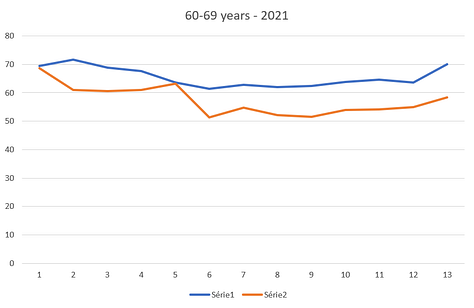
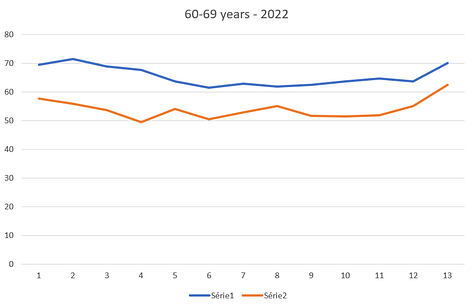
60-69 years deaths
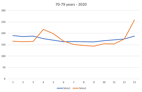
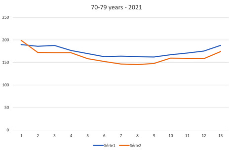
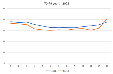
70-79 years deaths
80-89 years deaths
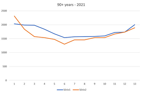
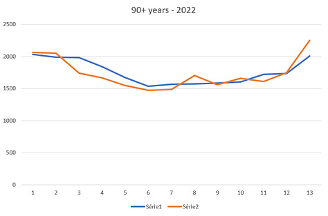
90+ years deaths
Live births to Baseline, 2020, 2021, 2022
We mentioned a small issue above in relation to the year 2022. We had an average of 114,715 births per year between 2010 & 2019.
Therefore, the year 2022, with its 104,734 births, represents a drop of 9,981 compared to the mean, which amounts to roughly 8.7% less than the average annual births in the decade from 2010-2019.
Assuming that the distribution of births across the years within each decade is approximately normally distributed, and that each year's births are independent from other years, we can compute a z-score, which is a measure of how many standard deviations an observation is from the mean. The short script that performs this task, which is represented below, is available on GitHub for you to verify the numbers.
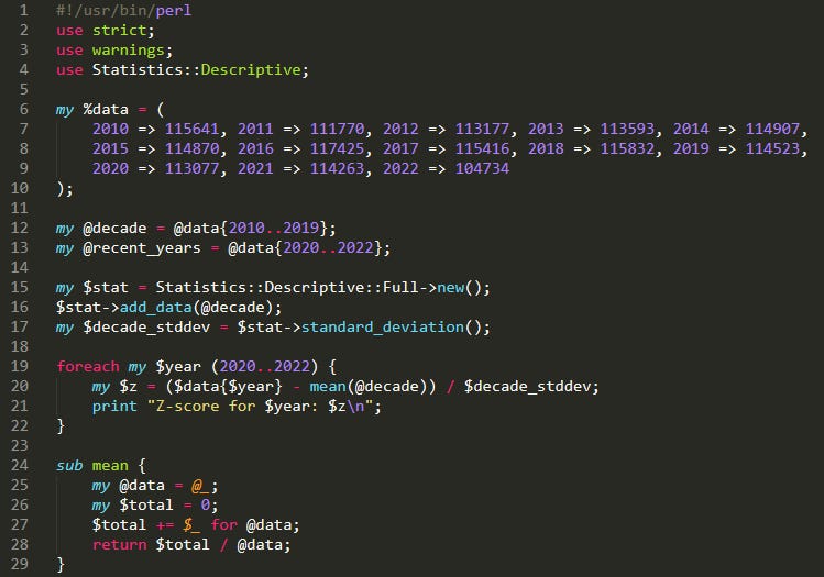
It results in a roughly -6.34 sigma drop in births if we compute a z-score to compare 2022 to the 2010 to 2019 trend.
- Z-score for 2020: -1.04001768826094
- Z-score for 2021: -0.287172852886502
- Z-score for 2022: -6.33595736914538
While it’s impossible to draw definitive conclusions from a single year, this is still what we would qualify commonly as a giant red flag prompting immediate in depth investigation.
The propagandist will - inevitably - argue that this phenomenon being absent from some countries (already heard “Monaco” - yes they are that stupid15), the “vaccine” can’t be blamed.
We shall therefore decline similar analytics on the next countries they quote, as they seem to excel in involuntarily pointing to stinky signals. Finland, also quoted as a proof of success, will be published shortly after this paper.
Several questions are of course left open. The fact that during the pandemic spike, the death rate is so high compared to Denmark, for example, was pointed by Geoff Pain as worth investigating.
Shall people wish to dig in before we find the time, you can find the code & sources below as usual.
Thanks for reading OpenVAET’s Substack! Subscribe for free to receive new posts and support my work.
Source Data
Births & Deaths are easily accessible on JSON or CSV format from statistikdatabasen.scb.se.
Births are taken from this table.
- Region Sweden - 00 Sweden
- age of the Mother - “Ålder, 1-årsklasser och 2 grupper”
- sex Men + Women
- Year 1968 - 2022
Deaths are taken from this other table.
- Region Sweden - 00 Sweden
- age - Age, 1 year age classes - 0 to 100+ years
- sex Men + Women
- Year 1968 - 2022
Population by age & sex can be obtained on this table.
- Age : One year age classes -> Select all
- Sex Men + Women
- Years : 2000 => 2022
Deaths by weeks can be obtained on this table.
Note: The first 2 lines (file descriptor) of each .CSV was removed, and in the population file, the “år” word was replaced by its “years” translation - in order to match the other files.
Covid deaths were fetched from the Swedish website (Statistics on deaths from covid-19) .
.CSV files are concatenated to a more digestible .JSON file accessible here16 using this other script.
Basic demographic stats are generated by the following script, and week-agglomerates deaths by this other script.
💬 Join the conversation
Want to like, comment, or share this article?
Head over to our Substack page to engage with the community.
Likes, comments, and shares are synchronized here every 5 minutes.
